I created five paperback books using the methods outlined in this article, and then published them with Lulu.com and Amazon’s Kindle Direct Publishing (KDP), which was formerly known as CreateSpace. I review in detail what you need to know to self-publish your own paperback book with either of these platforms.
You can correctly format the pages with a good word processor. I use Microsoft Word, which has the necessary features that help you create a “print image” of your book’s pages exactly as you want them to appear in the final printed form. I’ll explain all this in detail below.
Once you have finished your properly formatted manuscript, you can upload it for publishing. There’s no fee for this. You only pay for printed copies. This is known as Print-On-Demand.
CreateSpace has been replaced with Kindle Direct Publishing (KDP), which now provides combined tools for both paperback books and e-books.
You can import your Microsoft Word document, and all the formatting is recognized for a paperback book.
As for Kindle, a new tool that makes it easy to create a finished manuscript is Kindle Create, a downloadable application. It’s available for both a PC and a Mac. This app makes things a lot easier to accomplish. For example, you can format text with styles and themes, build a Table of Contents, add, align, and resize images, and much more.
Microsoft Word is an excellent tool for creating a print image of the pages of your book. As I mentioned, you can set the page size, margins, fonts, and font size with MS Word. So you can concentrate on writing your book, and let MS Word take care of the formatting.
Font Style
The suggested font to use for the main text of your book is 12pt Times New Roman. It’s best not to use exotic fonts, since they may not print as expected in the final print process.
Headings should be larger. I use 18pt to 24pt, depending on how much text is in my headings. You can experiment with that to make your headings look pleasing to the eye. The text for headings should be a Sans Serif font. That means they are block letters. They are without (sans) the curvy lines (Serif) like that of Times New Roman.
Note that Serif is easier to read, as the curves tend to let the reader’s eye flow more easily. But headings do not need this. On the contrary, you want headings to stand out.
So use a “San Serif type” for headings. A good example is Arial, although you can use Tahoma or Verdana too. These are all very common, and you won’t run into any issues with them looking different in the actual printed book than it looks on your screen.
Page Formatting and Setup
Page Setup is an important part of setting MS Word to format the pages properly to fit the size you plan for your book. The most common size for books to be sold by retail stores is 6" by 9". So I’ll give you the specs for that.
You want to have almost a one-inch margin on the top, bottom, and sides. This white space allows for errors with cutting pages for binding as well as leaving enough room so that the text on your pages does not seem to become clustered.
You also want to allow a little more room towards the spine. This is called the gutter. Its purpose is to compensate for the spine when opening the book, especially in thick books. Otherwise, the text may be hard to see near the spine without flattening out the book, which can cause damage to the binding.
So, how do you specify all this?
In MS Word, click the “File” link and then select “Page Setup” from the pull-down list. You’ll see all the fields for these settings, as shown in the following screenshot image.
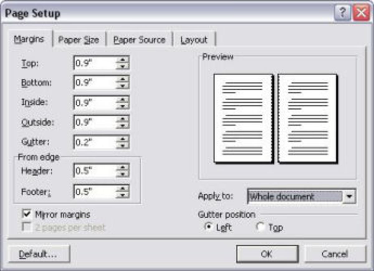
As shown in the above example, I prefer to use 0.9" for all margins. Almost 1 inch. Plus an extra half-inch for the header and footer to allow room for the headings and page numbers. Note how I also specified an extra 0.2" for the gutter.
You can also set the position of the header and footer. Since the top and bottom white space is almost an inch according to my settings, I allow the header and footer text to fall right in the middle of that space by setting it to be 0.5" from the edge, as shown in this image.
Make sure you set the checkmark for “Mirror margins.” That will make it handle the gutter on the left or the right, depending on whether it is an odd- or even-numbered page, respectively.
Also, apply the settings to the “whole document” so your settings are uniform throughout your book.
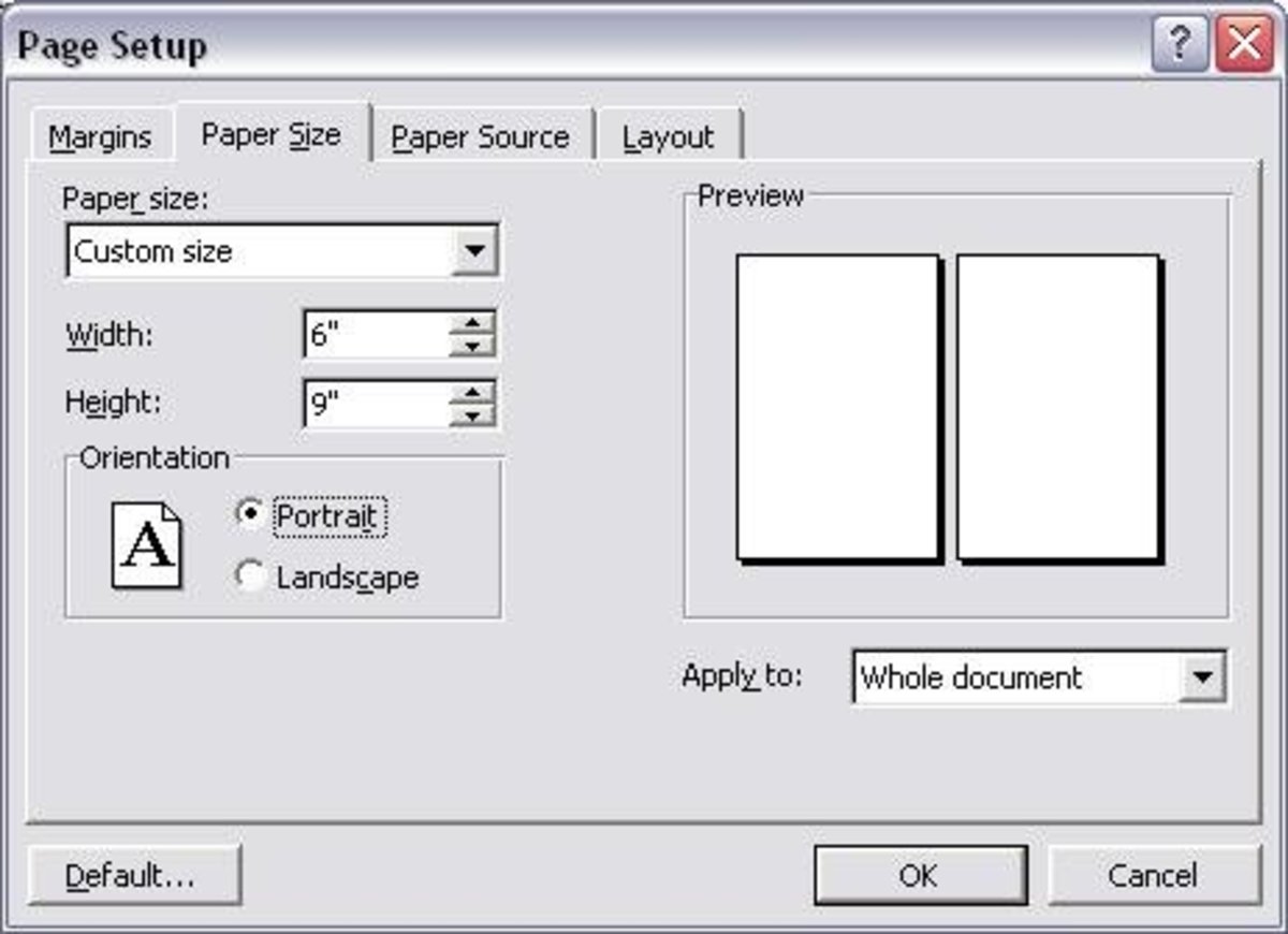
Set Page Size
Distribution to bookstores and libraries can be done with a 6x9 sized book. You need to have a minimum of 32 pages for a 6x9 size book. The max is 740 pages.
Other book sizes have slightly higher minimum page count requirements.
But if you want to have global distribution for sale in retail stores, you need to use a 6x9 book. So let’s concentrate on that.
Page Arrangement
If you are making a book for your own enjoyment, then the page positioning does not really matter, and you can do what you want.
But if you want to make your book available for distribution and possibly sell it in bookstores, then you need to follow strict rules. There are specific requirements. Here’s a list:
Individual Page Titles
I also like to stick with a rule of placing the book’s title on the top of every even-numbered page (left-hand page) and the chapter name on the top of each odd-numbered page, except for the first page of the chapter, where you probably have it anyway.
MS Word has a feature to propagate the even and odd page titles throughout the entire book for you. You need to specify that the headers and footers should be different on odd and even pages, as I’ve done in this sample screenshot:
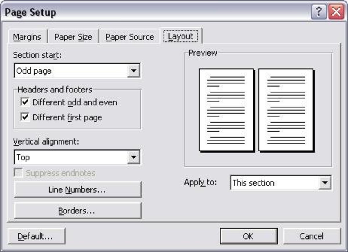
It’s important to specify “different even and odd pages” and “different first page” as shown above. That allows you to make the first page of each chapter different.
I prefer not to display the chapter name in the title field on the first page of each chapter because I already have the name in big letters anyway on that page.
Remember to use chapter breaks at the end of each chapter to make all this work properly.
MS Word can also create an index for you. If you decide to include an index, you should place it at the end of your book.
The use of MS Word is not the subject of this discussion. And you may be using another word processor anyway. So I suggest you learn the features and use the power of the program you use to get the most advantage out of it. It’ll be very much worth your time.
Line Spacing
If you are creating a manuscript to send to a publisher, they usually have strict rules about double-spacing. Editors require extra spacing to write edit comments.
However, when you are creating your own print image of the pages, you need to set the line spacing as it will appear in the printed book. Standard line spacing for a book is 1.5.
One can adjust the resulting number of pages by changing the line spacing. However, consider the fact that white space makes it easier on the eyes. So you don’t want to reduce the spacing too much.
If you have a thick book and you want to control the cost, tighten up a little on the line spacing without going to an extreme that makes it hard to read.
Was this meaningful to you? Tap
Using my suggested format of margins that are almost one inch, 12pt fonts, and a 6x9 book, you should average about 280 words per page. You would have a book with 100 pages if you wrote 28,000 words.
The number of words per page is highly variable. My book had a few pages with as many as 340 words.
Many things influence the number of words per page.
You can get more words on a page by making the margins smaller, but there are reasons for using the values I recommended. People find it easier to read when their eyes can rest.
The extra white space helps. If you fill a page from top to bottom and left to right with words, it becomes overwhelming to read. That’s why it’s crucial to leave white space all around the text.
If you have a large book, you may think that you want to use a smaller font to keep the cost of pages down. But keep in mind that the 12pt font is easy to read. So judge wisely if you plan to use text with smaller fonts.
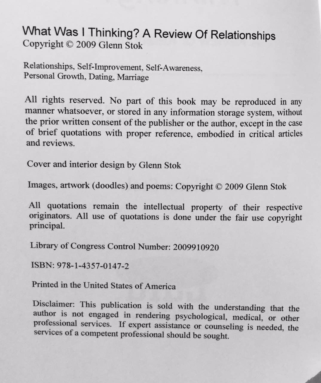
The copyright page contains specific copyright information. It goes behind the description page as a left-handed page.
See my example page below as you follow along. The title is on top. Below the title is your copyright notice. Below that, you can list some tags that indicate the subject matter of the book.
Below that is a short explanation of your rights and reproduction limitations.
Below that is an optional Library of Congress control number. I suggest you apply for that, as I did with my book. You can apply for a Preassigned Control Number (PCN) at www.loc.gov/publish/pcn/. They explain the process of applying for a PCN on their site.
Below that, you should list your ISBN if you already have it. When you purchase a distribution package from Lulu, they will give you one. Amazon’s Kindle Direct Publishing (KDP) also assigns an ISBN. You need to go back and edit your book to include it on your copyright page.
At the bottom, you should mention where the book is printed, such as “Printed in the United States of America.” But only include this if you limit the distribution to what you mention.
Below is the copyright page that I used in my book. You can follow the same layout and replace everything with your own information.
If you don’t feel you are very good at artwork design, Lulu has online tools that help you create a cover.
You can select from a library of sample art for your cover background design and then position your title, subtitle, and author name where you want them to appear. You can choose the color and font of the text as well.
You can also enter text to appear on the back cover and the spine. Lulu will put all this together to create the print image of the entire cover.
KDP includes a useful online cover designer. You can use it to quickly make your own front and rear covers for your paperback book.
The only thing I find awkward is the auto-formatting on the rear cover. You need to pay close attention to the final arrangement of text and make adjustments before going on to the next step.
If you are into designing your own artwork, you can create your cover with any good paint shop software and upload the front and back covers.
That’s what I did with some of my books. Three useful software editors are:
Lulu has three options for the cover of your book: Paperback, Casewrap, and Dust Jacket.
KDP offers two types of paperback covers.
I discovered that the glossy finish gets smudgy, so I prefer the matte finish.
Both Lulu and KDP help with completing the spine of your book. Based on the thickness of the book (number of pages), they automatically determine what font sizes you can use on the spine. They give you a choice of a few that will fit properly.
If you do decide to upload your own artwork, you will need to create ready-to-use files for the front and rear covers in the proper format. You’ve got to do this right, or it won’t fit. Here are the specifications you need to use for your cover image files:
Spines on a hard-covered book can have text printed on them, such as the book’s title and the author’s name. Lulu calculates the width of the spine automatically based on the number of pages in your book.
Three different types of spines can be selected for a paperback book, as listed below. Only the perfect-bound books can have text printed on the spine.
KDP does not have hardcover books. Their paperback books only have one type of spine, perfect bound.
The title and subtitle are placed on the spine, and you can change the fonts if you don’t like the default. The size of the spine is calculated automatically based on the number of pages. If you have fewer than 100 pages, the spine is too small for any text.
If you publish with Lulu, you can purchase one of three packages, depending on the type of distribution you want to have.
If you publish with KDP, your book will automatically be available worldwide through Amazon because they own that platform.
However, you can control the territory. If you only want distribution in certain countries, you can specify the territories in the setup process. This would be necessary if you have copyright regulations that only apply to certain countries.
If you do decide to purchase the ExtendedREACH or GlobalREACH Distribution with Lulu, you will have an ISBN assigned.
The cost of Lulu’s various distribution packages kept changing over the years, so you need to check their site for the latest information.
KDP, on the other hand, assigns a free ISBN and provides worldwide distribution.
The bar code for your ISBN will automatically be printed on the back cover of your book. So leave room for it if you create your own cover. The U.S. ISBN Agency assigns the ISBN, so your book is listed in Bowker’s Books-in-Print.

Everything you do to create your book on Lulu’s website or with Kindle Direct Publishing is free. But you do have to pay for ordering actual printed copies.
When you buy your own books, you only pay printing charges, not your own royalty. Printing costs vary depending on the size of the book, number of pages, the type of binding, and the paper grade you choose.
As an example, when I published my books, a 200-page 6x9 perfect-bound paperback with Lulu, using publisher-grade paper, cost $5.50 for a single copy. Pricing was similar with KDP. But check with them as prices may have increased.
You select the retail price when you decide to publish. You base this on the amount of royalty you want. The retail price is based on a total of three things:
You should get a printed copy so you can confirm that you did everything right. If you don’t want to spend any money, you can just let other people buy your book. But I don’t recommend that. It’s crucial to confirm that everything looks correct in the actual printed copy.
I bought a draft copy of my book each time I continued to improve it. I kept making changes after reviewing it because I didn’t like how one thing or another turned out. So I repeated the process until I was satisfied with the final draft copy.
You only pay the printing costs when you buy your own copy. When other people order it, they pay the retail price that you set, and you get a commission from the difference. You can specify the commission. Just don’t be greedy, or else the retail price will be too high, and it won’t sell.
Lulu and KDP fulfill all your sales, so you don’t need to be involved with order taking and distribution.
Do yourself a favor and proofread your manuscript before you waste money ordering your first copy. MS Word has a spelling checker, a grammar checker, and a thesaurus. So use them.
I often discover that I don’t catch my own errors. That seems to be a common problem for many writers. Our brain “sees” the words as we meant them instead of what’s typed on the page. So have a friend proofread for you.
I bought a few printed copies at first to hand out to good friends so they could proofread an actual paperback copy for me. I recommend you do the same. They even made notes in them that turned out to be useful feedback.
There is a big difference between publishing articles online and publishing a printed book. You can make changes and even add new content when you publish online. But obviously, you can’t do that with a book. So you’ve got to put effort into getting it right before you click the “publish” button.
I suggest that you print a sample of your book for yourself. Check it. Review everything. Not only proofread for spelling and typos, but also pay attention to the general way it looks to the eye.
You can make changes and upload a new file. Then order another sample and review it again. I’ve done that several times, over and over, uploading modifications each time. Trust me. It’s worth it. Because once you finalize it and publish your book, you can’t make changes anymore.
So that’s it. Now you know everything to get your book completed and published. When you put effort into the process, it will pay off for all the work you’ve already done writing your book.
Was this meaningful to you? Tap